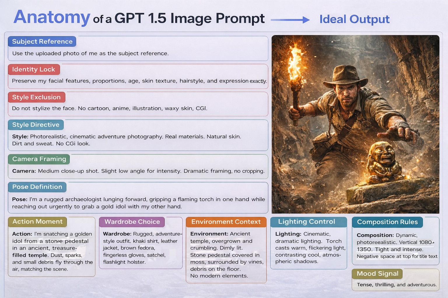
ViewChatGPT Image Prompt Template Eric Eden •0•3 days agoChatGPT (Image 1.5)ImageMarketingUse Magic2026-01-30T13:59:20.013Z
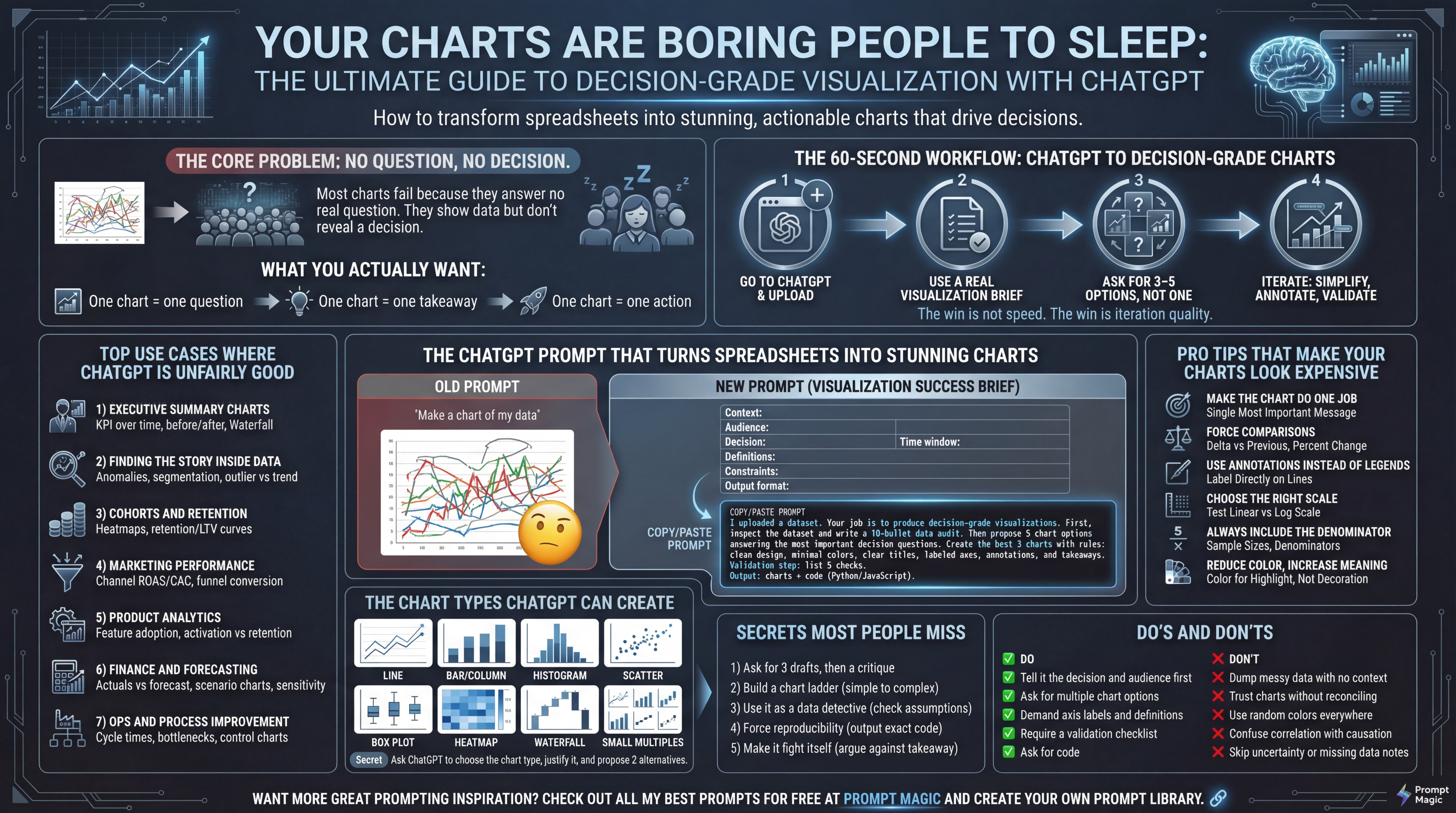
ViewCreate Charts and Visualizations with ChatGPTEric Eden •0•4 days agoChatGPT (Chatgpt 5)ImagePersonal productivityUse Magic2026-01-26T03:13:19.964Z
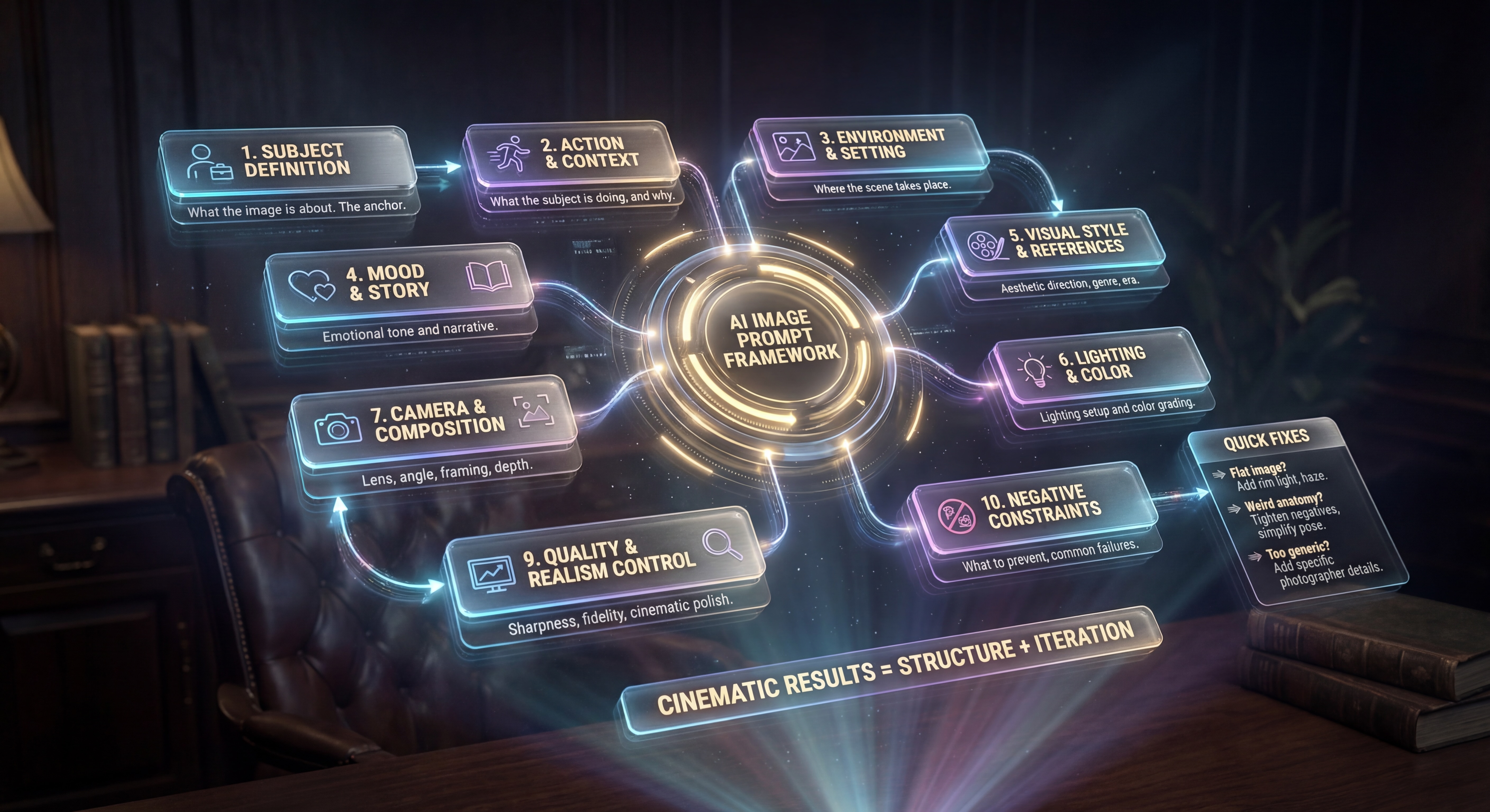
ViewImage Prompt TemplateEric Eden •0•YesterdayGemini (Nano banana)ImageMarketingUse Magic2026-01-25T18:55:54.033Z
ViewThe Gemini Icon Creation PromptEric Eden •0•2 weeks agoGemini (Nano banana pro)ImageFunUse Magic2026-01-20T00:10:53.896Z
ViewCreating isometric 3D landmark imagesEric Eden •0•YesterdayGemini (Nano banana)ImageUse Magic2025-12-13T16:07:51.014Z
ViewSelfie Inside Fort Knox Eric Eden •0•1 months agoGemini (Nano banana)ImageUse Magic2025-12-13T04:06:16.137Z
ViewCreate Hyperrealistic Miniature Cinematic style image using Nano Banana ProEric Eden •0•2 weeks agoGemini (Nano banana)ImageUse Magic2025-12-12T22:53:49.427Z
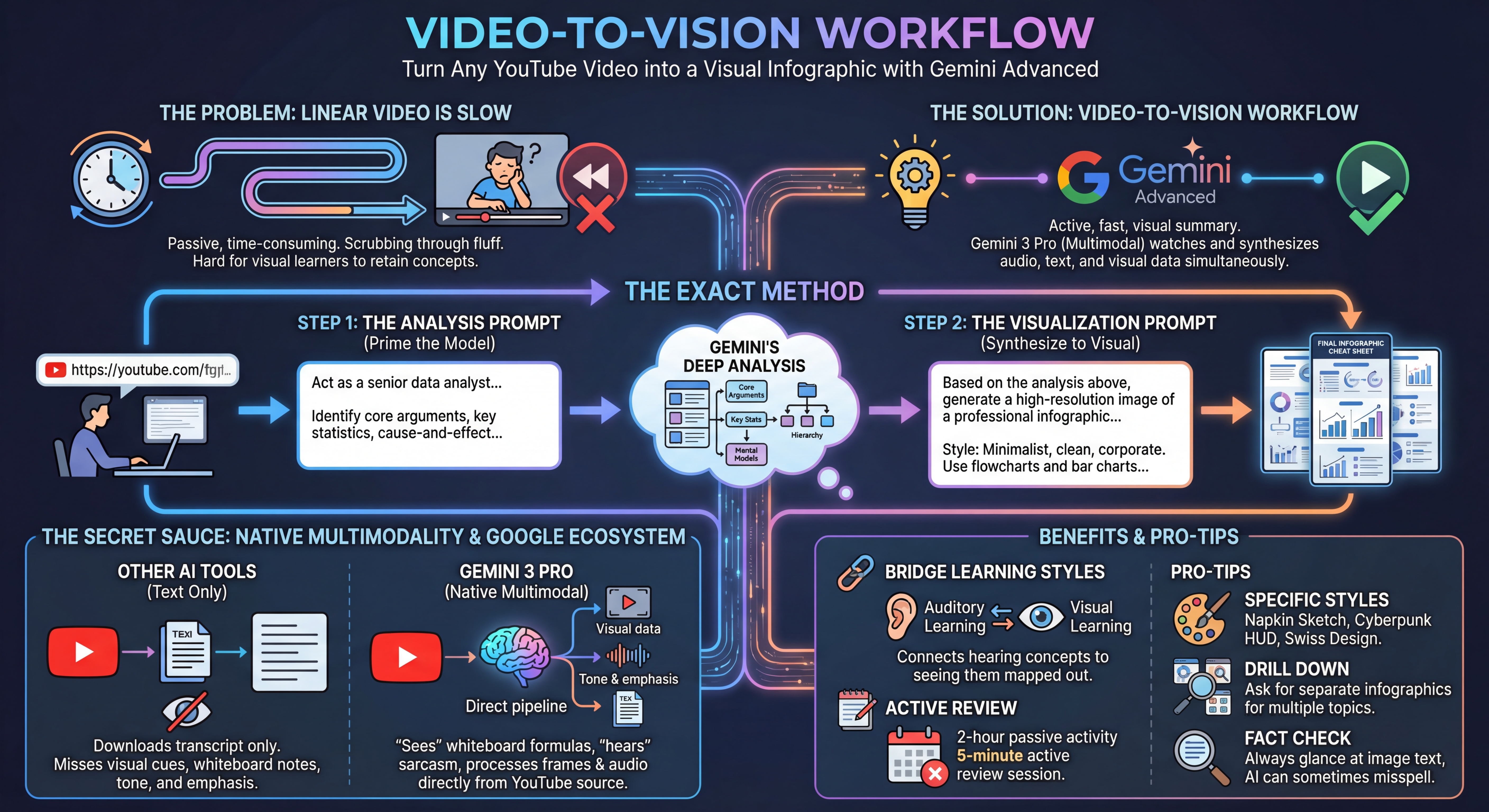
ViewTurn any YouTube Video into an Infographic Eric Eden •12•TodayGemini (Gemini 3)ImageAnalysisUse Magic2025-12-09T04:53:02.596Z
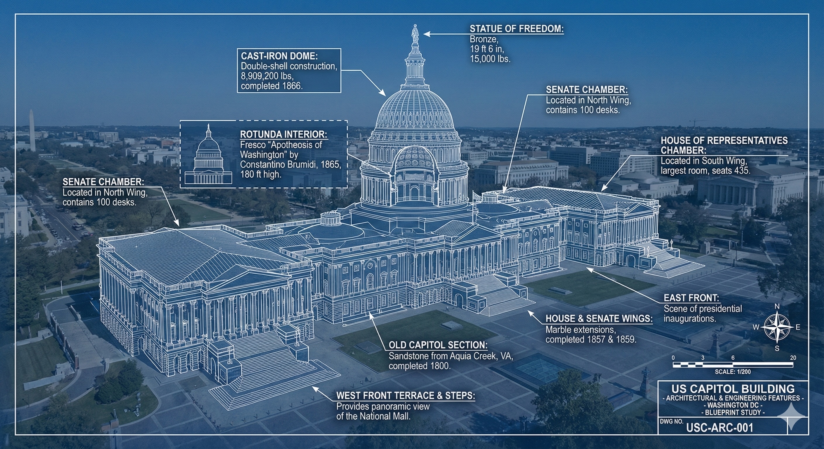
ViewPhoto Realistic Architecture of Buildings and Landmarks Eric Eden •10•1 weeks agoGemini (Nano banana)ImageUse Magic2025-12-01T21:20:14.011Z
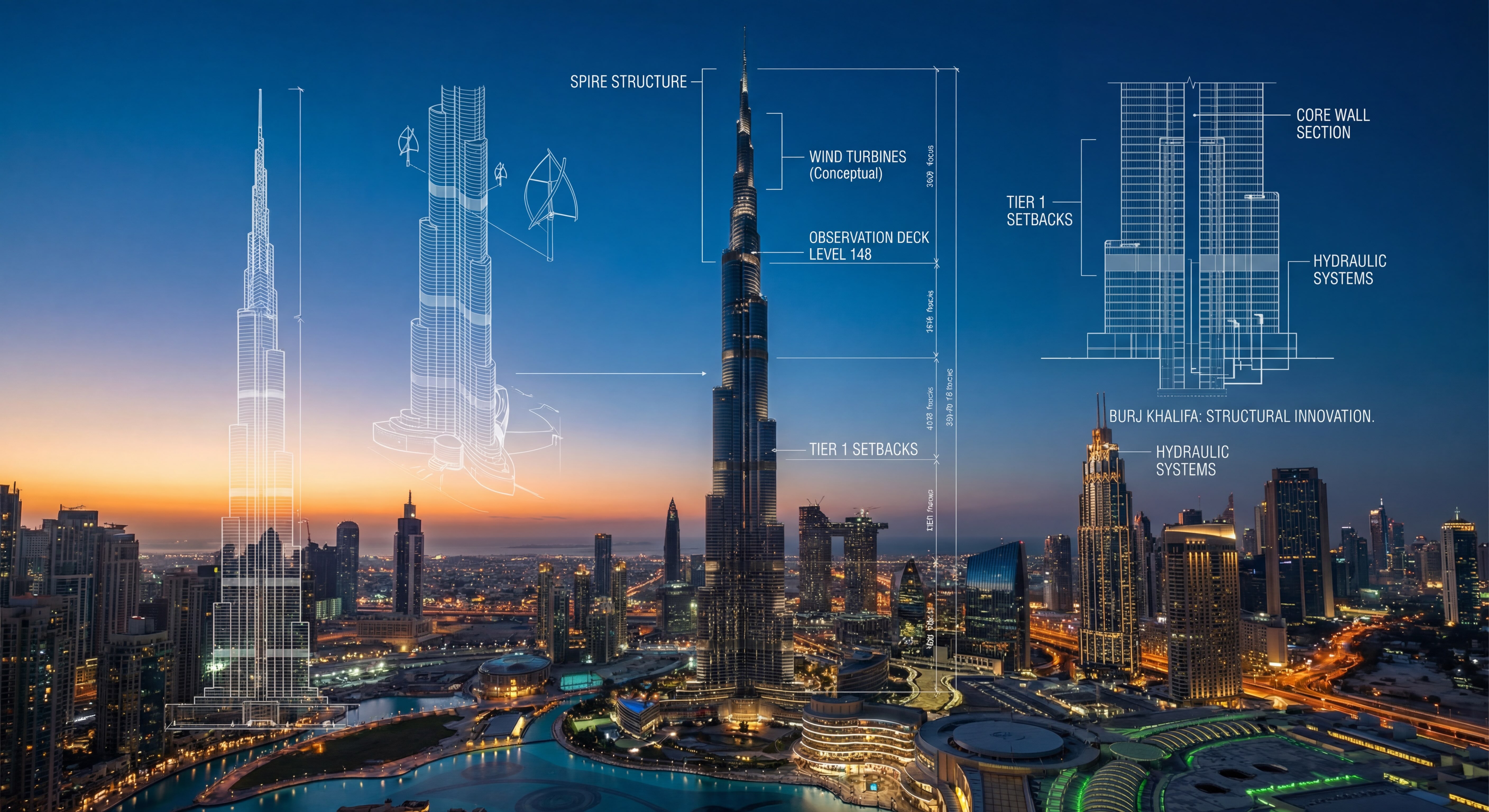
ViewX-Ray Architect for Landmarks / BuildingsEric Eden •8•3 weeks agoGemini (Nano banana)ImageUse Magic2025-12-01T21:01:41.220Z
ViewCreate Epic Recipe Cards with Nano Banana Pro on Gemini Eric Eden •17•1 weeks agoGemini (Nano banana)ImagePersonal productivityUse Magic2025-11-25T04:19:05.927Z
ViewCreate 3D Logo Eric Eden •61•YesterdayGemini (Nano banana)ImageMarketingUse Magic2025-11-11T01:41:51.880Z
ViewThe Enamel Pin MockupEric Eden •68•5 days agoGemini (Nano banana)ImageUse Magic2025-10-27T19:42:20.458Z
ViewThe Custom Merch Keychain Cameo Eric Eden •68•1 months agoGemini (Gemini 2.5 Pro)ImageUse Magic2025-10-27T19:39:51.870Z
ViewThe Above the Clouds Skydive CameoEric Eden •103•6 days agoGemini (Nano banana)ImageUse Magic2025-10-27T19:35:42.247Z
ViewThe Mission Impossible Hero CameoEric Eden •101•2 weeks agoGemini (Gemini 2.5 Pro)ImageUse Magic2025-10-27T19:32:30.000Z
ViewSuperhero Movie PosterEric Eden •106•2 weeks agoGemini (Nano banana)ImageUse Magic2025-10-14T04:46:14.959Z
ViewSci-Fi Space Opera Movie PosterEric Eden •95•6 days agoGemini (Nano banana)ImageNano Banana+1Use Magic2025-10-14T04:53:58.505Z
ViewHigh-Octane Action Movie Poster Eric Eden •161•6 days agoGemini (Nano banana)ImageNano Banana+1Use Magic2025-10-14T04:57:34.125Z
ViewDigital Portrait Art Prompt5.0 (1 rating)Eric Eden •220•TodayGemini (Nano banana)ImageUse Magic2025-10-12T17:38:53.968Z
ViewPerfect AI Image Prompt Template Eric Eden •128•1 months agoImage generationImageMidjourney 7+3Use Magic2025-10-07T17:25:31.192Z
ViewThe Intrepid Travel BloggerEric Eden •24•2 weeks agoGemini (Nano banana)ImageNano BananaUse Magic2025-10-05T01:11:35.159Z
ViewThe Luxury Lifestyle InfluencerEric Eden •40•TodayGemini (Nano banana)ImageNano BananaUse Magic2025-10-05T01:04:45.780Z
ViewThe Epic Fantasy Character PosterEric Eden •26•2 weeks agoGemini (Nano banana)ImageNano BananaUse Magic2025-10-05T00:59:43.404Z
ViewThe Editorial Beauty FeatureEric Eden •39•TodayGemini (Nano banana)ImageUse Magic2025-10-05T00:43:40.189Z
ViewThe Modern Tech FounderEric Eden •32•TodayGemini (Nano banana)ImageHeadshot+1Use Magic2025-10-05T00:39:04.400Z
ViewImage Prompt Architect 5.0 (1 rating)Eric Eden •61•5 days agoGemini (Gemini 2.5 Pro)ImageImage generation+1Use Magic2025-09-01T21:56:33.194Z
ViewYouTube Production Team Prompt 5.0 Eric Eden •18•1 weeks agoGemini (Opus 4.1)ImageMarketing+1Use Magic2025-09-14T15:57:37.545Z
ViewIced Coffee Drip Image Eric Eden •7•1 months agoMidjourney (Gemini 2.5 Pro)ImageImage generationUse Magic2025-09-22T02:19:25.395Z
ViewMojito with a TwistEric Eden •7•1 months agoMidjourney (Gemini 2.5 Pro)ImageImage generationUse Magic2025-09-22T02:14:41.933Z
ViewGQ Cover Shoot Eric Eden •138•YesterdayGemini (Gemini 2.5 Pro)ImageImage generation+2Use Magic2025-09-22T02:06:46.965Z
ViewLogo CreationEric Eden •23•4 weeks agoClaude (Gemini 2.5 Pro)ImageMarketing+1Use Magic2025-09-06T16:14:04.645Z
ViewImage Prompt Architect Eric Eden •22•5 days agoGemini (Gemini 2.5 Pro)ImageImage generation+1Use Magic2025-09-01T21:56:02.761Z
ViewPrompt to Create LinkedIn Profile Photo 5.0 Eric Eden •478•6 days agoChatGPT (Chatgpt 5)ImageMarketing+1Use Magic2025-08-15T04:39:39.549Z
ViewCreate an Infographic in Claude, Gemini or ChatGPT5.0 Eric Eden •98•1 months agoChatGPT (Opus 4.1)ImageMarketingUse Magic2025-08-14T23:46:17.837Z
ViewElite Brand Kit Generator (LLM + Image Gen Ready)Eric Eden •45•1 months agoGemini (Gemini 2.5 Pro)ImageMarketing+1Use Magic2025-08-14T23:15:46.663Z
ViewThe "JSON Remix": God-mode control and consistency in AI imagesEric Eden •71•2 weeks agoChatGPT (GPT-4)MarketingImage+4Use Magic2025-08-04T19:38:18.923Z
ViewCreate a Custom QR Code from ChatGPT PromptEric Eden •8•1 months agoChatGPTMarketingImage+2Use Magic2025-08-04T14:44:34.264Z